Lesson08 How to make the menu and a progress bar with Squareline Studio
Project introduction:
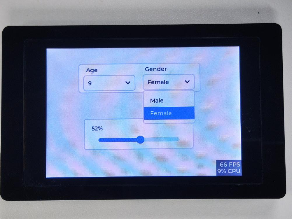
This project is a simple dropdown menu and progress display. Users can use the dropdown menu to select corresponding options to determine the content, which can facilitate users to enter related information. The slider can display related progress.
Introduction to Knowledge Points:
The following are the basic introductions of the widgets used in the project:
Dropdown menu:
A dropdown menu is a user interface control component typically used to provide a list of options in an application. It typically consists of a button and a dropdown menu. When the user clicks the button, the dropdown menu expands to show the available options. The user can select an option from the dropdown menu and use it in the application. Dropdown menus are widely used in many applications, including operating systems, web pages, and mobile applications.
Slider widget:
A slider widget is a user interface control typically used to adjust numeric values. It typically consists of a slider and a numeric display. Users can adjust the value by dragging the slider, and the value will be displayed in real-time in the numeric display area. Slider widgets are commonly used to adjust values such as volume, brightness, size, speed, etc. In many applications, slider widgets are also widely used, including operating systems, web pages, and mobile applications.
These UI elements are common in many applications and websites. They can help users complete tasks more easily and improve the user experience. In software development, pre-made UI libraries or frameworks can be used to create these UI elements, or code can be written to implement them.
Lesson8 project steps:
1 Create a new project in Squareline Studio as before. First, select the Arduino module, and then do some simple project settings such as project name and display size. Click "Create" to proceed.

2 Find the drop-down menu, panel, label and other components on the left toolbar, drag them to the panel first, and put the label and drop-down menu under the panel directory. Set the position and size as shown. You can also set some basic properties based on the content of the previous lesson to make the menu look better.
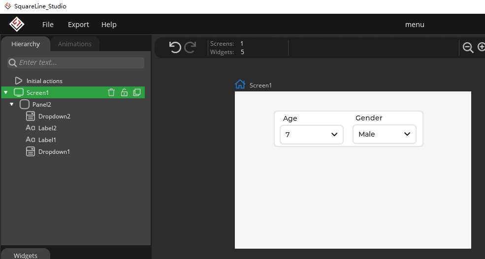
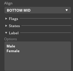
3 Then set the content options in the drop-down menu, with each line representing an option.

4 At this point, the selection of the drop-down menu is completed, and you can choose the correct option according to the actual situation.
5 Next, let's take a look at the progress bar. Similarly, add three widgets, and place the slider and label under the panel directory, and set the corresponding size and position.

6 Set the slider and label, and here the key is to link the slider and label. Add an event to the slider and set it as follows:

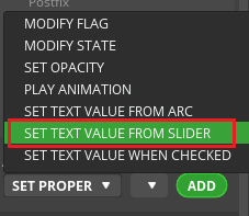
First, select "SET TEXT VALUE FROM SLIDER", then add an event setting, choose click trigger, the target is "Label4", and fill in the Postfix with "%".

This example project is very simple, but it can help beginners quickly understand the basic usage of the drop-down menu and slider widgets.
Running effect:
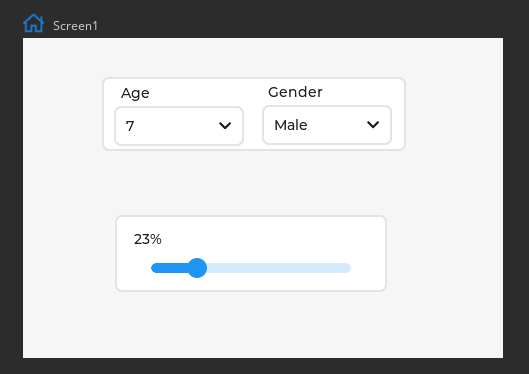
Following the method of downloading the program learned earlier, put the generated UI file in the Arduino library and see the effect on the screen.
Summary:
This project is very simple, but it can help beginners quickly understand the basic usage of the drop-down menu and slider widgets. In actual applications, it can be modified and extended as needed, such as adding a clear button, or formatting text.
HMI Display Tutorial Contents
- Lesson01 Introducing the ESP32 Display series and environment configuration
- Lesson02 Start the ESP32 DISPLAY GUI drawing via LovyanGFX Graphics Library
- Lesson03 How to Display Pictures on ESP32 Boards
- Lesson04 LVGL Basics: How to install LVGL for ESP32 Displays
- Lesson05 Introduction to the 5 categories of LVGL GUI library Widgets
- Lesson06 Use Squareline Studio to start your 1st human machine interface project
- Lesson07 How to implement text information input with Squareline Studio
- Lesson08 How to make the menu and a progress bar with Squareline Studio
- Lesson09 How to make an analysis report on ESP32 Display
- Lesson10 Create a 3D Printer UI Project on ESP32 Display
- Lesson11 How to Make a Mixer Interface on ESP32 Display
- Lesson12 Make Your ESP32 Display the Lantern Control terminal
- Lesson13 DIY Electronic Control Terminal on ESP32 Display with Squareline Studio
- Lesson14 Create Car Control Screen on ESP32 Display: A Step-by-Step Guide
- Lesson15 Smart Agriculture Monitoring: IoT-Based Real-Time ESP32 Display Project
- Lesson16 ESP32 Display for Smart Home Central Control: A Home Automation Solution