Lesson05 Introduction to the 5 categories of LVGL GUI library Widgets
Introduction to Widgets
LVGL is a lightweight, flexible, and cross-platform GUI library designed to provide efficient graphical user interfaces. It supports multiple operating systems and platforms, including embedded systems (such as Arduino and Raspberry Pi) and desktop systems (such as Windows and Linux). LVGL's API is simple and easy to use, providing many widgets and features that can help developers create beautiful and responsive user interfaces quickly. LVGL's widgets are highly customizable and can be configured in terms of size, shape, color, font, and icon to adapt to different application scenarios and user needs. LVGL also provides some advanced features such as animation, easing, gradient, and graphic drawing, allowing developers to create more complex user interfaces. There are five categories of widgets, as shown in the figure:
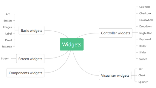
Below is a detailed introduction to all the widgets provided by LVGL. When using LVGL, you can refer to the information provided to configure the widgets.
Widget types
Screen
Screen is the main object. It defines the resolution of the work space and widgets can be added here. You can create several screens to your project. To switch among screens, you should use Screen Change event. Style part
- Main
Basic widgets
Basic widgets category includes main components. These are the most important elements of the screen.
Arc
You can draw an arc or create an interactive circle slider by using Arc widget. The arc consists of three elements:
- Background - The background of the arc
- Indicator - Using the arc as a curved bar, it indicates its value
- Knob - Using the arc as a curved slider, it gives a knob to the slider
Parameters of Arc Widget
- Range min, max - It defines the minimum and maximum values of the arc
- Value - Starter value
- Bg start, end angle - Start / End angle of the background in degrees
- Start, end angle - Start / End angle of the indicator in degrees
- Mode - You can choose from 3 different modes.
- Normal - The indicator arc is drawn from the minimum value to the current.
- Reverse - The indicator arc is drawn counter-clockwise from the maximum value to the current.
- Symmetrical - The indicator arc is drawn from the middle point to the current value.
- Rotation - An offset to the 0 degree position can be added
Style parts
- Main
- Indicator
- Knob
Button
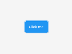
Button is a basic object. By using it, you can create a button fast and easily. Style part
- Main
Image
By using Image widget, images in the Asset folder are displayed. There are two options to display the images in the Asset folder. You can add an Image widget to the screen and set the image to be displayed or you can simply drag the preferred image from the Asset folder to the screen therefore it will appear automatically. Parameters of Image Widget
- Asset - You can select the image to be displayed on the widget from the image list in the Asset folder.
- Pivot X, Y - Pivot is the rotation and zoom center of the image.
- Rotation - Rotation angle in degrees.
- Scale - Scale for zooming in or out.
Style part
- Main
Label
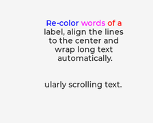
By using a Label Widget, you can add text to the screen. Parameters of Label Widget
- Label mode - You can choose different solutions for too long lines.
- Wrap - Wrap too long lines.
- Dot - Replaces the last 3 characters from the bottom right corner of the label with dots.
- Scroll - If the text is wider than the label, scroll it horizontally back and forth. If it's higher, scroll vertically. Only one direction is scrolled and horizontal scrolling has higher precedence.
- oScroll circular - If the text is wider than the label, scroll it horizontally continuously. If it's higher, scroll vertically. Only one direction is scrolled and horizontal scrolling has higher precedence.
- Clip - Clip the end of the text if the text is wider than the label.
- Text - You can add the text to be displayed.
- Recolor - In the text, you can use commands to recolor parts of the text. For example: "Write a #ff0000 red# word".
Style part
- Main
Panel
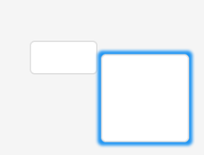
Panel Widget is a basic object. By using it, you can create a rectangle which can be transformed freely with styles. You can make rounded corners or add background color, shadows, borders, etc. Style parts
- Main
- Scrollbar
Text Area
Text Area is a Basic object with a Label and a cursor on it. Texts or characters can be added to it. Long lines are wrapped and when the text becomes long enough, the Text Area can be scrolled. Parameters of Text Area Widget
- Placeholder - Unique to Text Area, it allows styling the placeholder text.
- One line mode - The Text Area can be configured to be a single line. In this mode the height is set automatically to show only one line, line break characters are ignored, and word wrapping is disabled.
- Password mode - Text Area works like a password area. Characters are replaced by stars.
- Accepted characters - You can set a list of accepted characters. Other characters will be ignored.
- Max text length - The maximum number of characters can be limited.
Style parts
- Main
- Selected
- Cursor
- Placeholder
Controller widgets
Here, you can find widgets for controlling.
Calendar
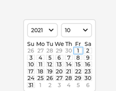
Calendar Widget is a classic calendar which can:
- show the days of any month in a 7x7 matrix
- show the name of the days
- highlight the current day (today)
- highlight any user-defined dates
Parameters of Calendar Widget
- Day, Month, Year - You can define the default date with these parameters.
Style parts
- Main
- Scrollbar
Checkbox
Checkbox Widget consists of a "tick box" object and a label. When Checkbox Widget is clicked, tick box is toggled. Parameters of Checkbox Widget
- Title - The name of the checkbox displayed next to it.
Style parts
- Main
- Indicator
Colorwheel
As its name implies, Color wheel allows the user to select a color. The Hue, Saturation and Value of the color can be selected separately. Long pressing the object, the color wheel will change to the next parameter of the color (hue, saturation or value). A double click will reset the current parameter. Parameters of Colorwheel Widget
- Mode - You can choose from three color select modes:
- Hue - Full color scale
- Saturation - Saturation of the selected color
- Value - Darker / Lighter version of the selected color
Style parts
- Main
- Knob
Dropdown
Drop-down Widget is a list that allows the user to select one value from a list. The drop-down list is closed by default and displays a single value or a predefined text. When activated (by clicking on the drop-down list), a list is created from which the user may select one option. When the user selects a new value, the list is deleted again and displays only the selected value. The Drop-down list is added to the default group (if it is set). Besides the Drop-down list is an editable object to allow selecting an option with encoder navigation too. Parameters of Dropdown Widget
- Options - Options are passed to the drop-down list as a string. You can create enlisted elements by adding new lines to the list.
- List align - Position of the list
- Show selected - It shows selected elements.
- Base text - This text appears by default.
- Maximum Height - The maximum height of the list in pixels.
Style parts
- Main
- Indicator
- List main
- List scrollbar
- List selected
Image button
The Image button is very similar to the simple 'Button' object. The only difference is that it displays user-defined images in each state instead of drawing a rectangle. You can set a left, right and center image, and the center image will be repeated to match the width of the object. Parameters of Image Button Widget
- Button state - Here you can select the state in which you would like to display the image.
- Released
- Pressed
- Disabled
- Checked Released
- Checked Pressed
- Checked Disabled
- Image released - You can select an image to the released state.
Style parts
- Main
Keyboard
Keyboard allows you to create a virtual keyboard on the screen. Parameters of Keyboard Widget
- Target text area - Keyboard Widget is a special Button matrix with predefined keymaps and other features to realize a virtual keyboard to write texts into a Text area.
- Mode - The Keyboards have the following modes:
- Text lower - Display lower case letters
- Text upper - Display upper case letters
- Text special - Display special characters
- Number - Display numbers, ± sign, and decimal dot
- User 1-3 - User-defined modes
Style parts
- Main
- Scrollbar
- Items
Roller
Roller allows you to simply select one option from a list by scrolling. Parameters of Roller Widget
- Options - Options you can select from the Roller list. You can create enlisted elements by adding new lines to the list.
- Text align - Position of the texts
- Mode - Switch between normal and infinite modes
- Normal - You can roll from start to end
- Infinite - You can reroll the list
- Visible row count - Setting the number of elements shown in the list
- Anim time - It defines the anim time during switching between the elements.
Style parts
- Main
- Selected
Slider
The Slider Widget looks like a Bar supplemented with a knob. The knob can be dragged to set a value. Just like Bar, Slider can be vertical or horizontal. Parameters of Slider Widget
- Min, Max - To specify the range (min, max values)
- Mode - The slider can be one of the following modes:
- Normal - A normal slider as described above
- Symmertical - Draw the indicator form the zero value to current value. Requires negative minimum range and positive maximum range.
- Range - Allows setting the start value too. The start value has to be always smaller than the end value.
- Value - Defines the current value of the slider.
- Value left - Defines the current value of the other knob of the slider.
Style parts
- Main
- Indicator
- Knob
Switch
Switch widget looks like a little slider and can be used to turn something on and off. Parameters of Switch Widget
- Anim time - Defines the animation time between on and off states.
Style parts
- Main
- Indicator
- Knob
Visualiser widgets
Visualiser widgets are those elements that are for displaying.
Bar
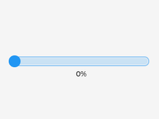
The bar widget has a background and an indicator on it. The width of the indicator is set according to the current value of the bar. Vertical bars can be created if the width of the object is smaller than its height. Not only the end, but also the start value of the bar can be set, which changes the start position of the indicator. Parameters of Bar Widget
- Min, Max - To specify the range (min, max values).
- Value - Defines the current value.
- Animate - Changes into the new value with an animation.
- Anim time - Defines animation time.
Style parts
- Main
- Indicator
Chart
Charts are a basic objects to visualize data points. It possible to use Line, Bar ans Scatter charts. Parameters of Bar Widget
- Chart
- Chart type - Type of the chart. Line, Bar o Scatter.
- Number of points - Number of point in each data series.
- Division line count X - Number of horizontal division lines
- Division line count Y - Number of vertical division lines
- Zoom X - Horizontal zoom.
- Zoom Y - Vertical zoom.
- X axis
- Major tick length - Length of major ticks
- Major tick count - Number of major ticks
- Minor tick lenght - Length of minor ticks
- Minor tick count - Number of minor ticks
- Label on X axis - Show/Hide labels on the axis.
- Font size on axis - Label distance from axis.
The chart supports two Y axis: Primary: on the left side Secondary: on the right side Primary and axis
-
- Primary Y range min - The smallest value of the axis.
- Primary Y range man - The largest value of the axis.
- Major tick count - Number of major ticks
- Minor tick lenght - Length of minor ticks
- Minor tick count - Number of minor ticks
- Label on Primary Y axis - Show/Hide labels on the axis.
- Font size Primary Y axis - Label distance from axis.
Primary and axis - Same as Primary Y axis Chart data Click ADD SERIES to add new data series to the chart. Data - You can set the color and the to which Y axis the series should be attached to. The values added to the Data field will be shown on the series. Style parts
- Main
- Scrolbar
- Items
In case of Bar chart the spacing between the bars can be adjusted with Items/Paddings/Pad Column parameter.
- Indicator
- Ticks
Spinner
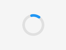
The Spinner object is a spinning arc over a ring. Style parts
- Main
- Arc
Styles
You can create a custom style to every widget. Using styles, you can define how a widget and its elements look like and which effects are in use.
Arc
Arc Style can be used in those widgets which have the Arc component.
- Line color - The color of the line
- Arc width - The width of the arc
- Arc rounded - The ends of the arc line are rounded
- Arc image - The background image for the arc line
Background
Background Style is the background of the widgets. You can create gradients or make the corners of the background rounded.
- Color and alpha - Set the background color and alpha of the object.
- Gradient color - Set the gradient color of the background.
- Bg main stop - Set the point from which the background color should start for gradients.
- Bg gradinet stop - Set the point from which the background's gradient color should start
- Bg radius - The radius you use to make the background corners rounded
- Gradient direction - The direction of the gradient. It can be horizontal or vertical.
- Clip corner - Enable to clip the overflowed content on the rounded corner.
Background Image
You can set an image as a background image.
- Bg image - The image you use as a background image
- Bg image opa - The opacity of the background image
- Recolor - With Recolor function, you can use a color on the background image. Set the color depth by changing the alpha parameter.
- Bg image tiled - If enabled, background image will be tiled
Blend
By using Blend Style, you can mix the pixel colors of the current widget part with the colors of the object followed by.
- Blend mode - Choose from four options.
- Normal - Default state
- Additive - Adding up pixels
- Subtractive - Subtract pixels
- Multiply - Multiply pixels
- Blend opacity - Here you can set the opacity of the widget part
Border
Using Border, you can draw a border around the selected object onto the inner lines.
- Border color - The color of the border
- Border width - The width of the border
- Border side - The direction of the border
Line
Line Style can be used in those widgets which have the Line component.
- Color - The color of the line
- Width - The width of the line
- Line rounded - The ends of the line will be rounded
- utline
- utline style is similar to Border style but here you draw the border around the selected widget part.
- Outline color - The color of the outline
- Outline width - The width of the outline
- Outline pad - Distance from the side of the widget in pixels
Paddings
Paddings style put a padding onto the widget part. It means parts under it in the hierarchy will shift by the distance defined in the padding with pixel values.
- Pad - The extent of the padding
Shadow
Using a Shadow Style, you can draw a shadow or a glow to the selected widget part.
- Shadow color - The color of the shadow
- Shadow width - The width of the shadow
- Shadow spread - The depth of the shadow
- Shadow OX - Shift the shadow on the X axis
- Shadow OY - Shift the shadow on the Y axis
Text
Text Style defines the parameters of the text that can be found on the widget.
- Text color - The color of the text
- Letter spacing - The space between the letters
- Line spacing - The space between the lines
- Text align - The direction of text alignment
- Text decor - You can overline or underline the text
- None - Normal text
- Understand - Underlined text
- Strikethrough - Overlined text
- Text font - The font of the text
HMI Display Tutorial Contents
- Lesson01 Introducing the ESP32 Display series and environment configuration
- Lesson02 Start the ESP32 DISPLAY GUI drawing via LovyanGFX Graphics Library
- Lesson03 How to Display Pictures on ESP32 Boards
- Lesson04 LVGL Basics: How to install LVGL for ESP32 Displays
- Lesson05 Introduction to the 5 categories of LVGL GUI library Widgets
- Lesson06 Use Squareline Studio to start your 1st human machine interface project
- Lesson07 How to implement text information input with Squareline Studio
- Lesson08 How to make the menu and a progress bar with Squareline Studio
- Lesson09 How to make an analysis report on ESP32 Display
- Lesson10 Create a 3D Printer UI Project on ESP32 Display
- Lesson11 How to Make a Mixer Interface on ESP32 Display
- Lesson12 Make Your ESP32 Display the Lantern Control terminal
- Lesson13 DIY Electronic Control Terminal on ESP32 Display with Squareline Studio
- Lesson14 Create Car Control Screen on ESP32 Display: A Step-by-Step Guide
- Lesson15 Smart Agriculture Monitoring: IoT-Based Real-Time ESP32 Display Project
- Lesson16 ESP32 Display for Smart Home Central Control: A Home Automation Solution

