Lesson07 How to implement text information input with Squareline Studio
Project Description:
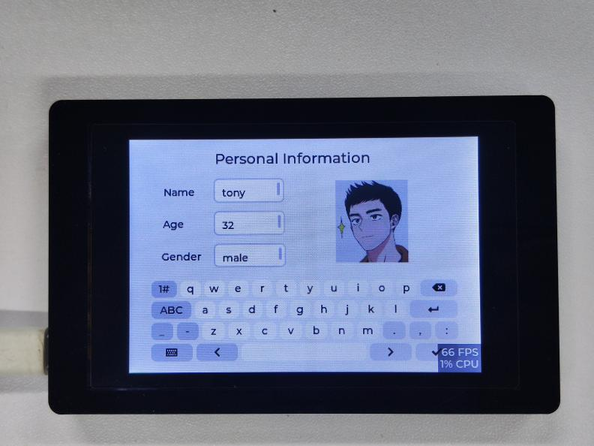
This project is a simple text input box where users can input text using a keyboard widget and see the inputted content in a text information widget. The main purpose of this project is to demonstrate the basic usage of the keyboard and text information widgets in Squareline Studio.
Introduction to Knowledge Points:
The following are the basic introductions to the widgets used in this project:
Keyboard Widget:
The keyboard widget can be used to capture the characters or keys that the user inputs on the keyboard. The keyboard widget's style, position, and size can be set in the properties panel, and it can also be connected to the corresponding events in a Python script to execute specific functions when the user inputs information. For example, you can listen to the "Key Down" event of the keyboard and connect it to a corresponding function in a Python script to execute specific code when the user presses a key on the keyboard.
Text Information Widget:
The text information widget can be used to display text information on the interface, such as explanatory text, prompt information, error messages, etc. The text information widget's style, position, and size can be set in the properties panel, and the text content to be displayed can also be set. Python scripts can be used to dynamically change the text information widget's text content, such as updating the text information widget's content when the user clicks a button.
Image Widget:
The image widget in Squareline Studio can be used to display images. The image widget can be added to the application's view and the image's source, size, position, and scaling properties can be set. Developers can also use APIs to dynamically change the image widget's properties, such as changing the image's source or changing the image's size and position.
Lesson7 Project Steps:
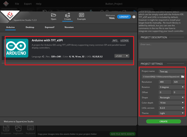
1 Create a new project in Squareline Studio. First, select the Arduino module, and then set up the project with simple settings, such as the project name and display size. Click "Create" to create the project.
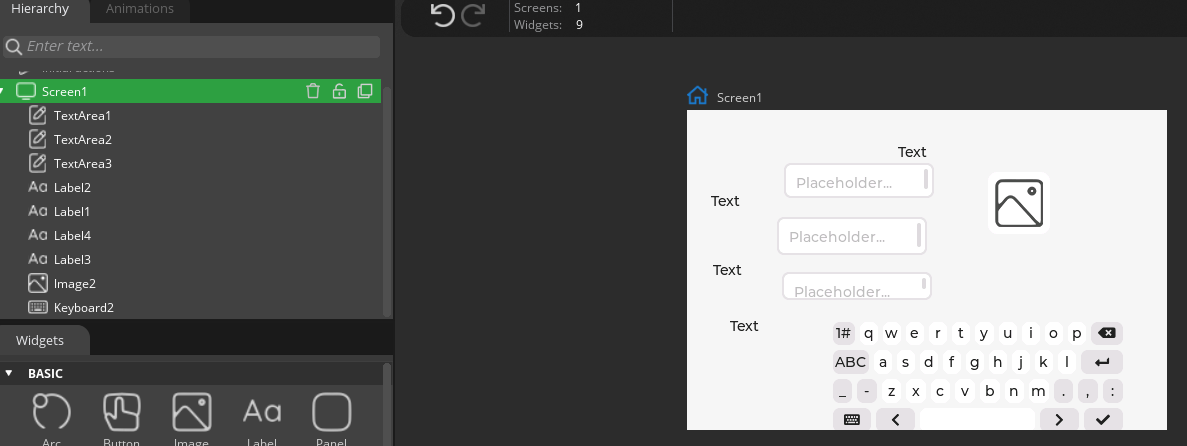
2 Find the text information, label, and image widgets in the left toolbar and add them to the properties panel.
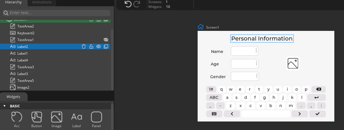
3 Adjust the positions with the mouse and set the text of the label according to the diagram.
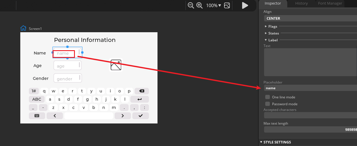
4 Set the "Placeholder" content of the three texts, which is the content that prompts the user to fill in.
5 Add the image information for the image widget.
First add the material file, currently the software only supports png format.

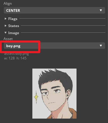
6 Then, go to the text widget's attribute settings, and in the "Add Event" settings at the bottom, select the keyboard target as "KEYBOARD SET TARGET" and then select Keyboard2 as the keyboard and TextArea as the target. This way, the text and keyboard can be linked. The same settings apply to the other two texts.
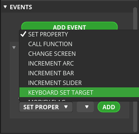
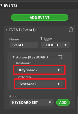
7 After setting up, click "Run", then click on the text widget, and when the cursor appears, press the button to enter text information.
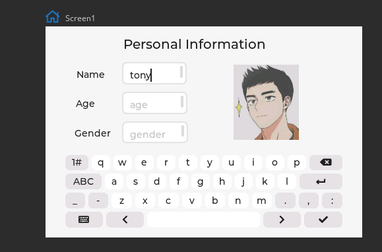 This example project is straightforward, but it can help beginners quickly understand the basic usage of the keyboard and text information widgets. In practical applications, it can be modified and expanded as needed, such as adding a clear button or adding formatted text functionality.
Summary:
This project is straightforward, but it can help beginners quickly understand the basic usage of the keyboard and text information widgets. In practical applications, it can be modified and expanded as needed, such as adding a clear button or adding formatted text functionality.
HMI Display Tutorial Contents
- Lesson01 Introducing the ESP32 Display series and environment configuration
- Lesson02 Start the ESP32 DISPLAY GUI drawing via LovyanGFX Graphics Library
- Lesson03 How to Display Pictures on ESP32 Boards
- Lesson04 LVGL Basics: How to install LVGL for ESP32 Displays
- Lesson05 Introduction to the 5 categories of LVGL GUI library Widgets
- Lesson06 Use Squareline Studio to start your 1st human machine interface project
- Lesson07 How to implement text information input with Squareline Studio
- Lesson08 How to make the menu and a progress bar with Squareline Studio
- Lesson09 How to make an analysis report on ESP32 Display
- Lesson10 Create a 3D Printer UI Project on ESP32 Display
- Lesson11 How to Make a Mixer Interface on ESP32 Display
- Lesson12 Make Your ESP32 Display the Lantern Control terminal
- Lesson13 DIY Electronic Control Terminal on ESP32 Display with Squareline Studio
- Lesson14 Create Car Control Screen on ESP32 Display: A Step-by-Step Guide
- Lesson15 Smart Agriculture Monitoring: IoT-Based Real-Time ESP32 Display Project
- Lesson16 ESP32 Display for Smart Home Central Control: A Home Automation Solution