Lesson11 How to Make a Mixer Interface on ESP32 Display
Project Introduction:
A mixer UI typically includes multiple tracks and control panels. We can use Squareline Studio's layout tool to create an interface with multiple panels. Each panel can represent a track or a control panel. We can use Spinner widgets to create a control panel that includes Spinner widgets for adjusting parameters such as volume, gain, balance, etc.
Introduction to Knowledge Points:
Here are basic introductions to the widgets used in the project:
"ARC" Widget: The "ARC" widget is a UI widget in Squareline Studio used to create arc-shaped shapes. It can be used to create UI elements such as progress bars, counters, timers, etc. Users can create arcs of different shapes and sizes by modifying the properties of the "ARC" widget, such as radius, line width, starting angle, and ending angle.
Animation: Animation is a way to add dynamic elements to a user interface. In Squareline Studio, you can use animation to create many different types of effects, such as fading in and out, translation, rotation, scaling, etc. Animation can increase visual appeal and make the user interface more vivid and interesting. In Squareline Studio, you can use the built-in animation library to create various animation effects and apply them to different UI elements. You can also specify animation attributes such as duration, easing function, repeat count, etc., to achieve the desired effect.
In summary, by using the ARC widget and animation, you can create more interactive and vivid user interfaces. In Squareline Studio, these features are very easy to use and can help you quickly create captivating UI designs. Next, we'll use the ESP32 Terminal 3.5 inch RGB screen as an example to showcase the UI content.
Project Steps:
Note: First add the provided image material file!
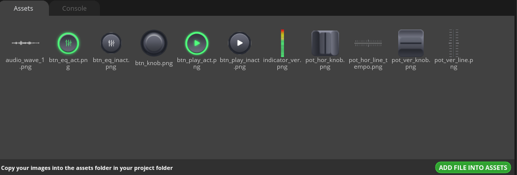
1 Create a new project in Squareline Studio as before. First select the Arduino module, and then make simple settings for the project, such as the project name and display size, because this UI is vertical, the size needs to be changed to 320*480. Click create.

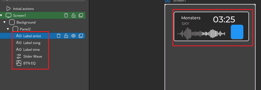
2 Set up the information display panel, add panel, label, image button, and slider components, adjust and set their positions according to the image hierarchy.
1)Add relevant components under the panel;

2)Set the component name for identification and distinguish it, and set the relevant attribute parameters and positions to form a good display page. The background of the slider component and the progress bar of the indicator should be consistent with the background of the higher-level panel, add progress bar material, and hide the knob to achieve the illustrated effect.
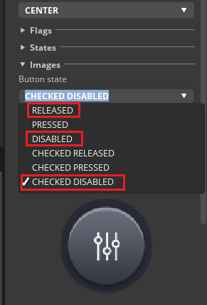
3)Set the button graphic state
① Check the Checkable option;

② Choose different patterns for different button states. For RELEASED, DISABLED, and CHECKED DISABLED, choose the btn_eq_inpact.png image. For PRESSED, CHECKED RELEASED, and CHECKED PRESSED, choose the btn_eq_pact.png image.

3 Add left channel volume control, and add a progress bar and label according to the illustration.
1)Add a panel under the background panel, and then add a slider and two labels under the panel, and name them;

2)Set the slider, first adjust the position with the mouse.
① Set the slider background, background image, and width;
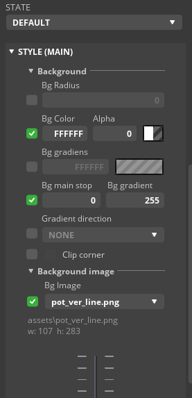

② Set the indicator parameters;

③ Set the knob parameters;
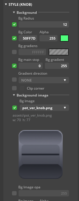
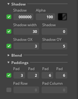

3)Set the label content and position.

4)Add right channel adjustment, directly copy the left channel panel, and adjust the position.

5 Add the play button;
① Check Checkable;
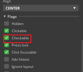
② Choose different patterns for different button states. For RELEASED, DISABLED, and CHECKED DISABLED, choose the btn_play_inact.png image. For PRESSED, CHECKED RELEASED, and CHECKED PRESSED, choose the btn_play_act.png image.
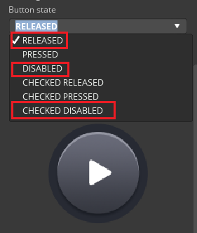

6 Set up the second page panel, first hide the three modules designed earlier as shown in the illustration:

1)Add ARC, image, and label components, and move the mouse to the appropriate position;

2)Set the ARC parameters;

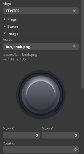
3)Add the image component's image file;
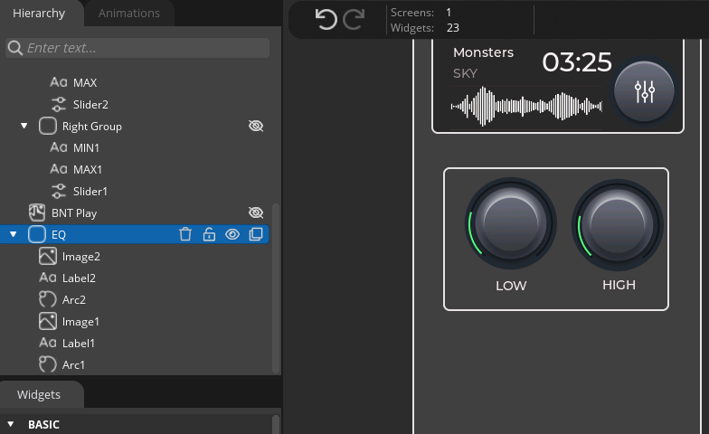
4)Copy the EQ components and place them on the right, and modify the label name;
7 Finally, add the rhythm balance slider. Add the slider. The set parameters refer to the parameters set for the slider above, which are basically the same. Pay attention to the slider bar parameter settings as follows:

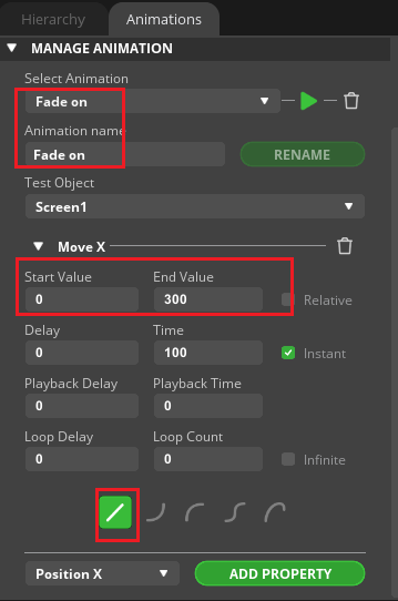
8 Add animation and set two animations;

9 Add event settings to BTN EQ.
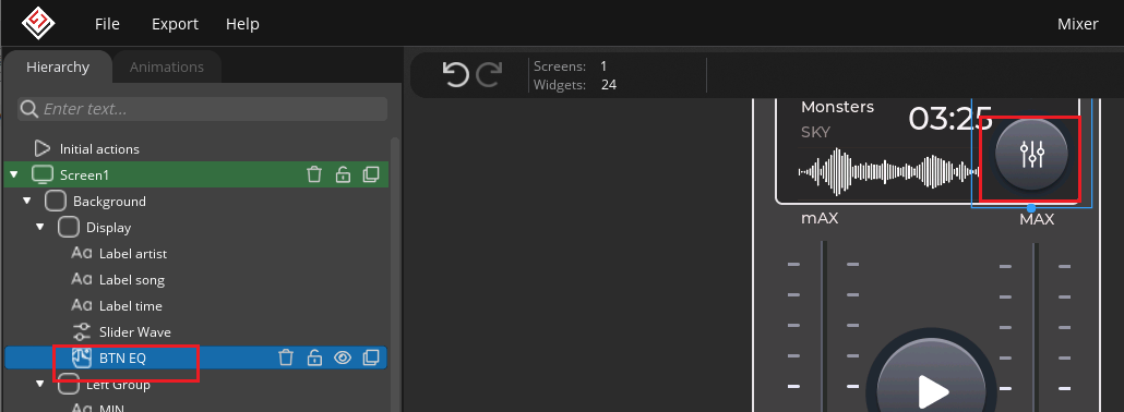
1)When in the CHECKED state, hide "Right Group", "Left Group", "BNT Play", and display "EQ" and "Slider4".

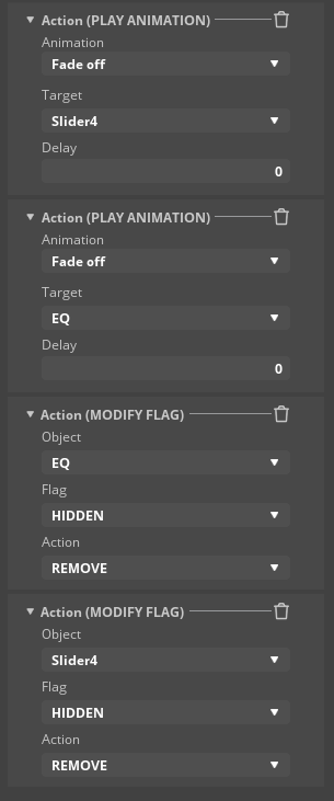
2)When in the UNCHECKED state, display "Right Group", "Left Group", "BNT Play", and hide "EQ" and "Slider4".


Running effect:
1)Click Export in the software to generate a UI file, and put the new UI file in the Arduino library, and then download the LVGL_RGB_1 (vertical screen case) example provided by the official to the ESP32_rgb terminal.
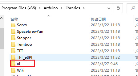 ) 2)After the program is successfully downloaded, check the effect on the screen.
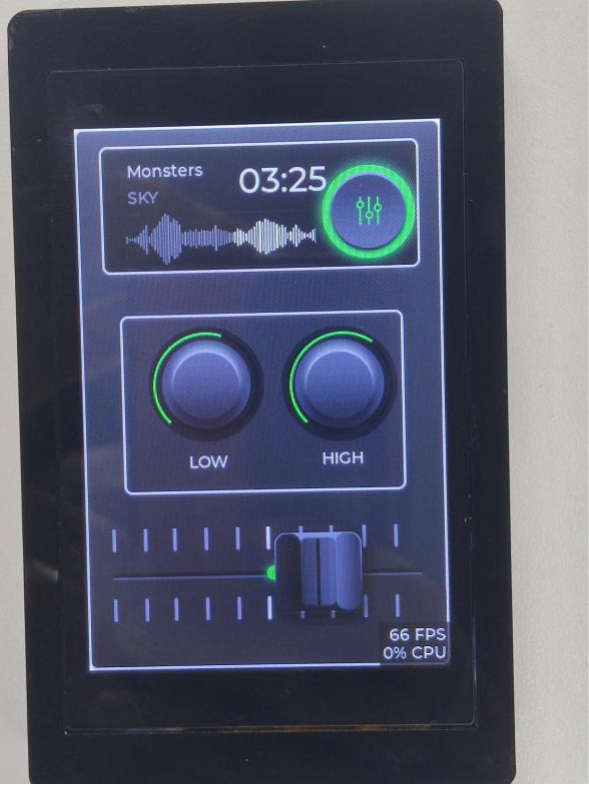
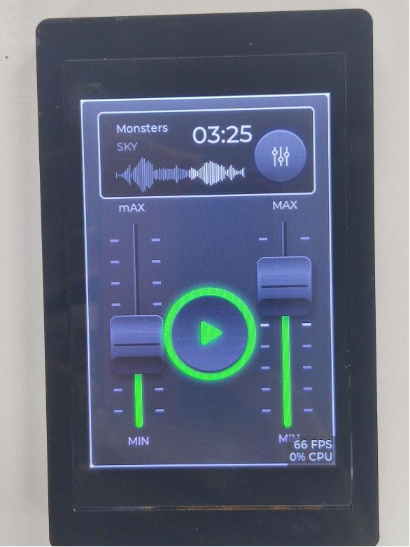
Summary:
This project helps beginners to quickly understand the basic usage of the ARC component and animation, and adds the function of hiding and displaying panels, realizing the replication of the mixer UI interface, which is very practical. In practical applications, it can be modified and extended according to needs, and more settings and functions can be added.
HMI Display Tutorial Contents
- Lesson01 Introducing the ESP32 Display series and environment configuration
- Lesson02 Start the ESP32 DISPLAY GUI drawing via LovyanGFX Graphics Library
- Lesson03 How to Display Pictures on ESP32 Boards
- Lesson04 LVGL Basics: How to install LVGL for ESP32 Displays
- Lesson05 Introduction to the 5 categories of LVGL GUI library Widgets
- Lesson06 Use Squareline Studio to start your 1st human machine interface project
- Lesson07 How to implement text information input with Squareline Studio
- Lesson08 How to make the menu and a progress bar with Squareline Studio
- Lesson09 How to make an analysis report on ESP32 Display
- Lesson10 Create a 3D Printer UI Project on ESP32 Display
- Lesson11 How to Make a Mixer Interface on ESP32 Display
- Lesson12 Make Your ESP32 Display the Lantern Control terminal
- Lesson13 DIY Electronic Control Terminal on ESP32 Display with Squareline Studio
- Lesson14 Create Car Control Screen on ESP32 Display: A Step-by-Step Guide
- Lesson15 Smart Agriculture Monitoring: IoT-Based Real-Time ESP32 Display Project
- Lesson16 ESP32 Display for Smart Home Central Control: A Home Automation Solution